Knowledge base
Categories
Page template and configuration options
In this article we will take a look at the available post and page templates and go through the rest of the provided post/page configuration options.
Page configuration
Configuration takes place in the Page tab on the right hand sidebar when editing a post or page.
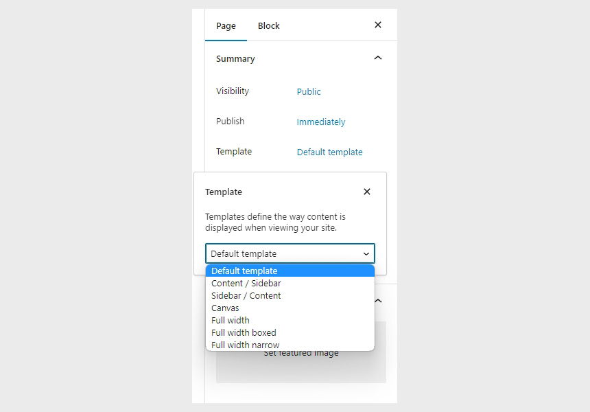
The Summary metabox houses the available template options these override the layout selected in the Customizer. These are:
- Default template: When this template is selected the item gets a content/sidebar layout, or whatever is set under Site Options > Layout in the Customizer.
- Content / Sidebar: Items with this template will always display the content on the left and the sidebar on the right.
- Sidebar / Content: Items with this template will always display the sidebar on the left and the content on the right.
- Canvas: This is a completely blank (no header, menu or footer) template to be used with page builders and full site editors.
- Full width: The content area on items with this template will span from one edge of the screen to the other. No sidebar is available on this template.
- Full width boxed: The content area on items with this template will span the entire content width as set under Site Options > Layout in the Customizer. No sidebar is available on this template.
- Full width narrow: Like the full width boxed template, but the content is a bit narrower. No sidebar is available on this template.
The Excerpt metabox can be used to display a custom subtitle on the Page Title section on pages (area just below the logo/menu – example).
Page settings
Using the Page Settings metabox, users can fine tune the appearance of individual pages. Many of these options will override ones set in the respective sections in the Customizer, allowing users to create unique page appearance for each item. Options are either disabled by default or set to respect global values set in the Customizer. Let’s take a closer look at the options.
Top Bar
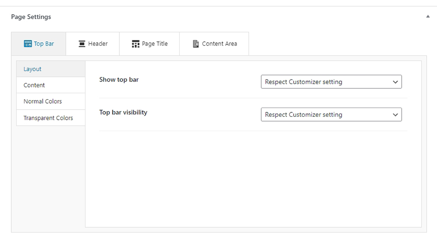
- Layout
- Show top bar: Enable/disable top bar. can be entirely disabled if needed via the provided checkbox or set to be visible only on specific devices.
- Top bar visibility: Select on which devices will the top bar be visible.
- Content
- Left content area: can accept plain text, HTML or any of the framework’s built in shortcodes.
- Middle content area: can accept plain text, HTML or any of the framework’s built in shortcodes.
- Right content area: can accept plain text, HTML or any of the framework’s built in shortcodes.
- Normal Colors: choose the colors of the top bar when the header is set to the normal layout.
- Transparent Colors: choose the colors of the top bar when the header is set to the transparent layout.
Header
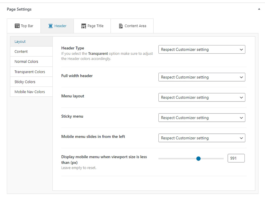
- Layout
- Header Type: By default the item respects the layout set in the Customizer. Users can override it and choose to display either a transparent or a normal header.
- Full width header: The header can be also made fullwidth, which means it won’t be restricted to the width set in the Customizer but will span the entire viewport.
- Menu layout: The menu can be to the left, right of the logo, centered (below the logo) or split to two separate menus with the logo between them.
- Sticky menu: Enables/disables Sticky menu and its behavior.
- Mobile menu slides in from the left: Toggles the way mobile menu appears.
- Display mobile menu when viewport size is less than (px): set the viewport width below which the mobile menu will be displayed.
- Content
- Content area: can accept plain text, HTML or any of the framework’s built in shortcodes.
- Normal Colors: choose the colors and the background image of the header when is set to the normal layout.
- Transparent Colors: choose the colors and the background image of the header when is set to the transparent layout.
- Sticky Colors: choose the colors and the background image of the header when Sticky menu is enabled.
- Mobile Nav Colors: choose the mobile menu colors.
Page Title
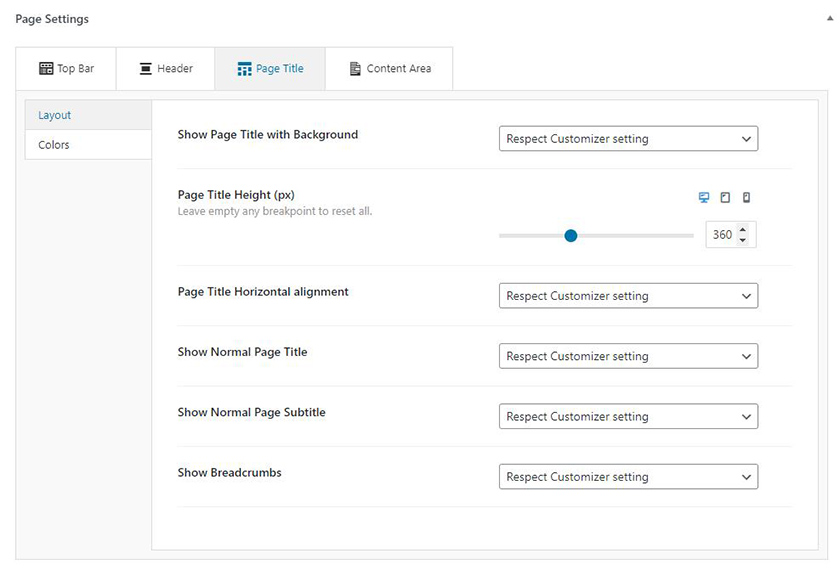
- Layout
- Show Page Title with Background: This option allows users to toggle the appearance of the Page Title section individually. A custom background image can be set via the Page Title > Colors section (see below). By default will follow the Customizer setting.
- Page Title Height (px): Set the section’s height on various devices.
- Page Title Horizontal alignment: Change page title’s horizontal alignment.
- Show Normal Page Title: This option toggles the appearance of the default page title. Useful if you have enabled the Page Title with Background and do not want the title to appear twice, or if you have disabled them globally and want to show it on the particular post or page.
- Show Normal Page Subtitle: Similarly with the title before, this option can individually toggle the page subtitle. By default the Customizer setting is respected.
- Show Breadcrumbs: Toggles the appearance of the breadcrumbs. Needs one of the supported breadcrumb plugins installed and activated. Single posts and post listings inherit the settings from the blog page and similarly single products and product archives follow the option set in the Shop page.
- Colors: Choose the colors and the background image/video of the page title.
Content Area
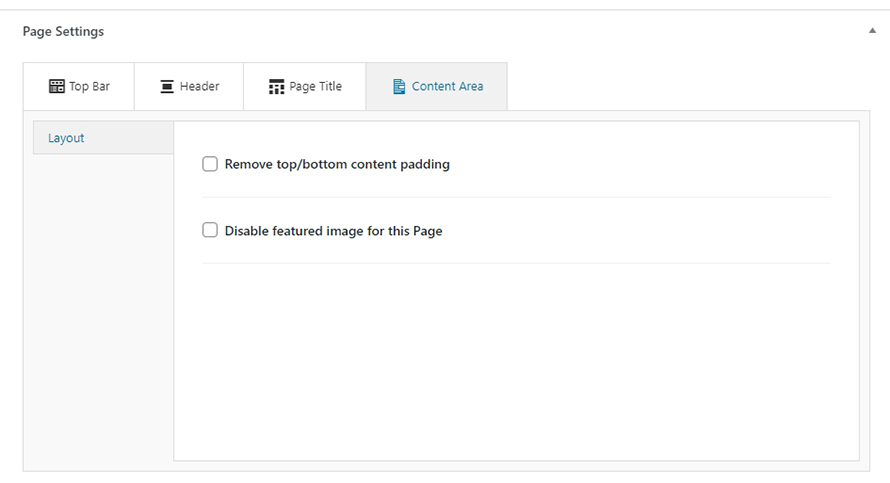
- Remove top/bottom content padding: Enabling this option will remove the padding around the main content (after the Page title section and before the footer). Useful when utilizing page builders and want to handle spacing with greater accuracy.
- Disable featured image for this item: Enabling this option will hide the featured image from the item’s single view, the featured image will still appear in listings.
Custom Post Type settings
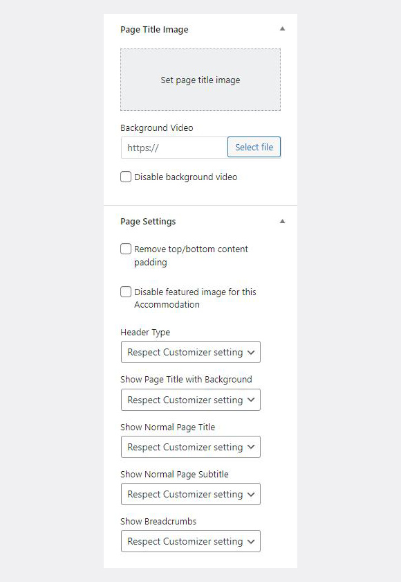
Some themes have custom post types (e.g. services, portfolio, accommodations, etc). On those pages, the Page Title Image metabox and the Page Settings are located in the right sidebar. Let’s take a closer look at the options.
- Remove top/bottom content padding: Enabling this option will remove the padding around the main content (after the Page title section and before the footer). Useful when utilizing page builders and want to handle spacing with greater accuracy.
- Disable featured image for this item: Enabling this option will hide the featured image from the item’s single view, the featured image will still appear in listings.
- Header Type: By default the item respects the layout set in the Customizer. Users can override it and choose to display either a transparent or a normal header.
- Show Page Title with Background: This option allows users to toggle the appearance of the Page Title section individually. A custom background image can be set via the Page Title Image metabox as described above. By default will follow the Customizer setting.
- Show Normal Page Title: This option toggles the appearance of the default page title. Useful if you have enabled the Page Title with Background and do not want the title to appear twice, or if you have disabled them globally and want to show it on the particular post or page.
- Show Normal Page Subtitle: Similarly with the title before, this option can individually toggle the page subtitle. By default the Customizer setting is respected.
- Show Breadcrumbs: Toggles the appearance of the breadcrumbs. Needs one of the supported breadcrumb plugins installed and activated. Single posts and post listings inherit the settings from the blog page and similarly single products and product archives follow the option set in the Shop page.
The Page Title Image metabox can be used to set a custom background image for the Page Title section of the particular item. This will override the default background image set under Page Title in the Customizer.